Lark Health | AI coaching mobile app

First time user experience
Project summary
The Lark Diabetes Prevention Program (DPP) is a CDC approved coaching program designed to help users with pre-diabetes build healthy habits and reduce their risk of developing diabetes. The Lark app delivers this program through an AI coach via a conversation interface. My first project at Lark was to redesign the Lark mobile app onboarding experience for this program.
The challenge
Only 53% of eligible and enrolled DPP users completed onboarding and it took on average 30 hours to complete the flow. Collecting information and communicating the value of the program through a conversation interface was slow. This meant that we often lost users before onboarding completion or they didn’t hit early program milestones as expected. This negatively impacted patient’s long-term success in the program and also lead to loss of revenue for Lark.
Project goals
Increase patient onboarding completion rate
Introduce new patients to their plan in a straightforward and engaging way
Build initial trust between the Lark coach and patients
Improve patients’ agency and autonomy in setting up personal health goals
My role
Lead product designer
UX Research
Collaborated with the UX research team to plan and synthesize moderated usability testing.
Stakeholder collaboration
Led co-creation workshops and weekly design reviews with stakeholders to align on designs.
Development support
Provided a detailed handoff, additional guidance where needed and new designs for unforeseen edge cases.
Lead design
Created all wireframes and prototypes, and led visual design. Built out new components for our design library.
Design QA
Analyzed existing and created new content for the updated onboarding experience.
Copywriting + UX writing
Conducted QA testing prior to release to identify bugs and inconsistencies with designs.
Results
21% increase in onboarding completion within 2 days of starting the program.
19% increase in patient weight data collection within 2 days. This metric is tied to long term patient success and engagement.
Improved understanding and interest in the DPP coaching app.
Increased engagement early in the the program; health data logs increased by 11% in week 1, 10% in week 2 and 13% in week 3.
Process
Discovery
To understand usability issues within the current experience and validate assumptions I worked with a UX researcher to plan user research. In preparation, I analyzed the existing experience to understand its structure and figure out areas of focus for user testing.
I also looked at competitors and apps in other fields to understand common onboarding features and what an ideal experience could encompass.
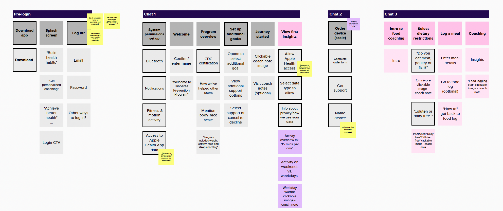
Flow analysis
Going through and capturing each screen of the existing onboarding flow helped me identify several areas of friction to dig into in usability testing. Some usability issues stood out.


Time-consuming to complete
The experience was extremely long. While there were several points at which the user was given the option to exit and come back later, this meant it took days to complete onboarding.
Cumbersome interactions that made it hard to enter required information efficiently.
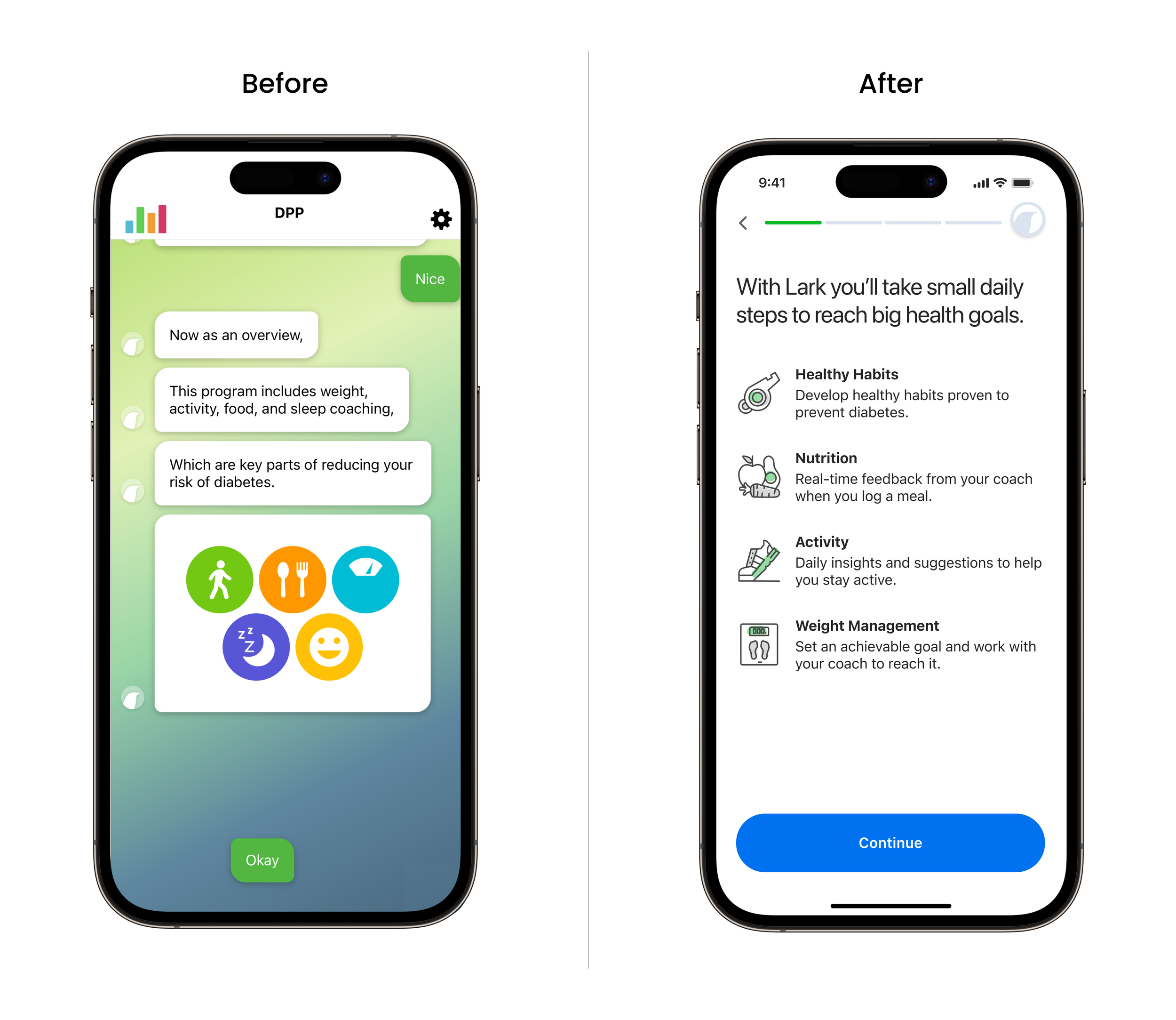
Superfluous content
Visual styles were inconsistent and imagery took up a lot of space within the conversation screens, requiring the user to scroll back to see it. Additionally, the imagery impeded rather than enhanced the messaging.
Superfluous and repetitive content that didn’t add much value.
Lack of structure
The experience was almost entirely conversation-based and lacked a clear structure. I found myself getting disorientated completing tasks and was unclear at what point I would start the program.
The absence of a progress indicator made the conversation feel never-ending.
Usability testing
I worked with a UX researcher to gather insights through moderated usability tests with users who had similar profiles to those of real patients. Testers walked through as much of the flow as possible in one session while sharing their thoughts.

High level findings
“All participants had a good start. They were excited about what the app had to offer via the app store and splash screens. They were positive about the initial conversations…
…Participants were generally task-driven. They were excited to get started with tasks like food logging, reviewing insights. However, they lost interest over the conversations required to get to the tasks…”
Michelle Chen, Senior UX Researcher leading moderated tests
Competitive analysis

I signed up for several apps, most but not all health related, that do a great job onboarding new users. Some useful examples were Headspace, Duolingo and Calm who all kept onboarding short, succinct and got users started with tasks right out of the gate.
UX research & design workshop
The UX researcher and I prepared a two-part workshop split over two mornings with key stakeholders. Our goal was to align on business goals and the user needs we solving for and collaborate on generating some solutions. Participants included individuals from data science, engineering, product management, design and the clinical team.
Session 1 - Understand business goals and user needs
Share and discuss research findings to understand user context and pain points
Share and discuss business goals with product stakeholders
Reframe problems as opportunities using ‘How Might We…’ statements
Prioritized these key areas to focus on

Session 2 - Brainstorm solutions
Share and discuss competitive analysis findings to understand what makes a successful onboarding experience
Identify challenges and opportunities around redesigning the onboarding experience
Generate solutions in a Round Robin design activity
Align on a direction by voting on ideas to take forward

Design
Through research I learned that:
Users were very task driven and enjoyed seeing insights and advice about their health, which felt both useful and personalized to them
In testing, the coach shone when it came to offering support, empathy and building rapport
At the same time, the coach conversation experience felt annoying, repetitive and time-consuming, when used for certain tasks
Many users had already tried similar apps and wondered “What’s different about Lark?”
How might we address users’ questions and concerns, take care of required set-up and get them excited about their new program quickly and efficiently?
Content design
I used this document to help firm up requirements with product. This process also began my collaboration with our conversation designer to define how a conversation and non-conversation experience could work together cohesively. We began to layout a structure and flesh out content.
To get started I created a map of existing and proposed content that address both user and business needs. I identified the appropriate ways to deliver each type of content most efficiently.
Directional flows
I initially designed two high-level concepts to share with stakeholders and align on the future experience. After reviewing these internally with the product manager, CTO, engineering, clinical and design team we decided to go with concept one for the phase one release. This version would require less brand and coach persona definition and was therefore more feasible for MVP.
Concept 1
Non-conversation screens are used to gather required data and tell the user about their coach and program. The user doesn’t truly begin interacting with the coach until they have completed certain tasks. Lark is referred in the third person as opposed to the first person. This was a significant departure from the current conversation experience.

Concept 2
More emphasis on Lark as your guide through onboarding. Lark is referred to as the coach, or ‘I’. This experience would be heavier on personification and rapport building. Like the first concept, the onboarding screens would not be a conversation UI, but they would feel conversational. The coach would be integrated throughout onboarding, giving users a taste of what they can expect without the cumbersome interaction required by chatting back and forth.

Prototype
I created high-fidelity wireframes and built a prototype to prepare for some initial rounds of feedback and testing.
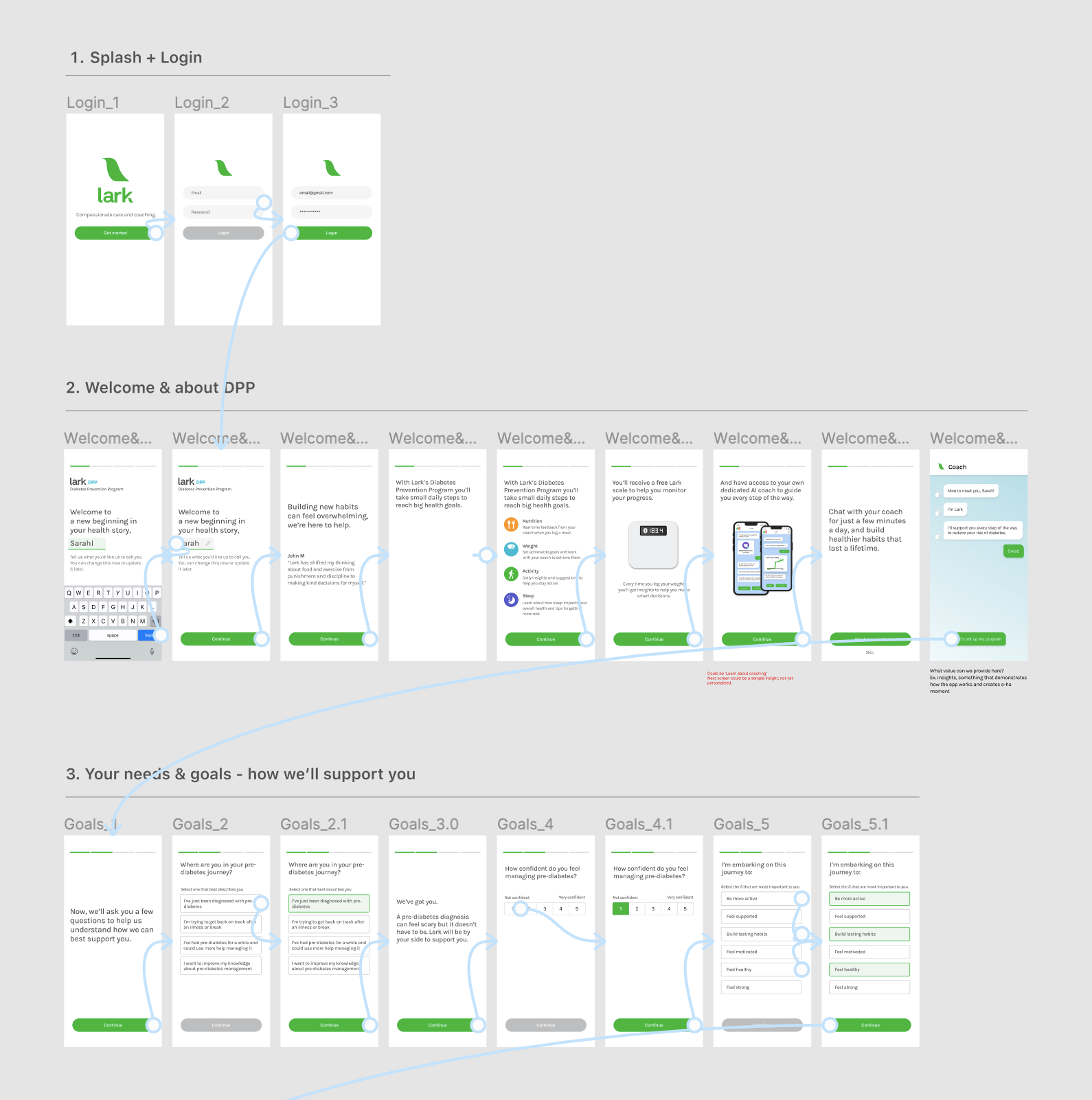
Using a non-conversation interface allowed me to design defined sections that could be tracked with a progress indicator. Users would be able to see where they were in the experience and that they were making progress. We could also educate users about the program, peak their interest and collect the required information far more efficiently.
I interspersed the flow with screens that highlighted Lark’s value and built connection by emphasizing Lark’s understanding about pre-diabetes and its challenges. Many users were scared about the possibility of developing diabetes and Lark had the tools to help them achieve their health goals, we just needed to inform users more effectively out of the gate.
To give users a taste of how Lark really works I added in an interaction with the coach in those initial screens. This was a quick ‘Hi’ from Lark, where users could have a short conversation with their coach but could skip it if they preferred.
Copywriting
We didn’t have a copywriter on the team so I took this task on from the beginning of the project. Excluding any coach conversation, I wrote the copy for all onboarding screens and updated as needed in response to feedback. Given what I had learned in user testing, I knew it was important to create opportunities to make people feel understood and clear about how the program could help them.

Connecting the conversation experience
The conversation UI is where users interact with their coach, Lark. This is the core experience of the app.
Alongside designing the non-conversation onboarding screens I collaborated with our conversation designer on the coach intro within this flow. We brainstormed the follow-on experience, too; when the user begins working with their coach. We had identified the required content that would be best delivered through the coach, now we needed to figure out how to structure it and transition smoothly from a non-conversation experience to the coach conversation.
One point of frustration for users in the existing experience was their lack of control around what type of coaching they began with (ex. food coaching, activity coaching or weight coaching). To address this I initially designed a jumping-off screen at the end of the onboarding flow that would take users into the coach conversation. The user could select what they wanted to begin with.
We ultimately had to omit that screen due to engineering constraints so instead I included a simple transition screen with an animation to mark the transition from onboarding to the beginning of the users coaching program.
Usability testing and results
Once I had completed the Figma prototype I worked with the UX researcher again on the testing plan. The main goal at this point was to learn how users felt about the program based on the description we provide in the experience, the types of questions they are asked and the length of the flow. The conversation that comes after the initial onboarding screens wasn’t complete but we wanted to make sure this new initial onboarding experience was headed in the right direction. I attended all the usability test sessions and once the research was complete the researcher and I synthesized findings together.

What went well
Overall, participants were engaged throughout the process
They found the flow easy to complete. The length felt appropriate. All said they would complete onboarding in one go
All wanted to order the device (a digital scale) that comes with the program, even though they had the option to skip at this point
They understood what the program entailed, which made them intrigued to find out how the app actually works
All felt comfortable sharing their information during the flow such as weight, height and dietary restrictions. They expected these questions and it made them feel the app would personalize their experience
What could be improved
There was some confusion about what the Lark coach is at first, whether it’s a live coach or an AI coach. This became clear as they went through the flow
Users were intrigued to know how the app actually works and what comes after onboarding:
Is the AI coach as smart as they’d like it to be?
How does this app actually work? Is it for me?
There were mixed responses about meeting the coach in the middle of onboarding. Many users wanted to keep going with the experience and save interacting with the coach until onboarding was finished and coaching could truly begin. Some were curious about the coach and wanted to try it out
Apple phone users were not clear about why we request access to health data such blood pressure and blood glucose when the program didn’t appear to require metrics like this
Research results paraphrased from a research presentation created by Michelle Chen, Senior UX Researcher.
Iteration and further testing
By this point, the team and I felt confident about the new onboarding flow. I worked on addressing areas that were called out in research and made the following adjustments:
Clarified descriptions about the program such as how coaching works and digital scale features
Moved the coach intro conversation to the beginning of the onboarding flow so it mirrored more closely the real app experience. This would prevent interruption in the flow later. We also used this coach conversation to confirm the users name, fulfilling a requirement while adding a friendly ‘nice to meet you’ exchange between the coach and the user
Given that users were comfortable with the information we gathered in the first version, we trialed some new questions that would eventually help us better personalize the program for users

In the second round of usability testing most of the feedback we received was around copy and minor usability issues. I updated the design based on this feedback, and began thinking about the visual design and illustration direction. We also had clinical, product management and marketing teams sign off on designs.
Visual design
Since this was an entirely new experience, outside of the existing conversation UI, I had an opportunity to evolve the design system we were currently using. The coaching screens contained a lot of older design assets and the branding felt dated. I put together several visual design concepts and gathered feedback from the wider design team.


We eventually landed on Concept 2, which had a clean and modern aesthetic. I worked with the branding team to create new illustrations that would amplify the experience and compassionate personality of the coach. I designed a template for each screen type with a clear visual hierarchy. New components and styles I designed for this experience were added to our component library for wider use across the app.
Dark mode
Once I’d designed all the screens and components for the new experience, I created a dark mode version.

Supporting development
Because this experience touched so many parts of the app it took multiple engineering teams to build it. Once designs were approved and in development some unexpected engineering blockers arose that required me to to rethink how certain features were designed so we could hit our release date.
Some things I revisited were the permissions flows for health data access on iOS and Android, dynamic personalized screens and error handling for device ordering. I worked with product and engineering teams to understand what solutions were possible and, where necessary, created MVP solutions. I followed up with product to plan post-release fast follows that would eventually add in the optimal version of any features that were unsupported in MVP.

QA
I took a very hands-on approach to QA, making sure that the experience matched what was designed as closely as possible on both iOS and Android devices. I documented issues and bugs in detail and followed up to make sure the experience was performing as intended before release.

Post-release results
21% increase in onboarding completion within 2 days of starting the program.
19% increase in patient weight data collection within 2 days. This metric is tied to long term patient success and engagement.
Improved understanding and interest in the DPP coaching app.
Increased engagement early in the the program; health data logs increased by 11% in week 1, 10% in week 2 and 13% in week 3.
Before & After


Post-release updates
Though we were able to test the new onboarding screens before release we were unable to test it alongside the conversation that followed due to project time constraints.
We chose to release, test and iterate based on user feedback. Shortly after release we looked at quantitative research to identify areas of potential friction. While we saw improvements in the completion rate and user engagement post-onboarding, there were areas we needed to optimize further.
Further qualitative user research
We identified an opportunity to improve early engagement with Missions, an educational series within the app, by using the onboarding and conversational flows to introduce it more effectively.
The user’s first Mission, a key milestone both for user engagement and company revenue, was introduced right after the tutorial conversation but rates of completion remained low.
We conducted a round of user testing, this time including the onboarding experience, the tutorial conversation (intro to coaching) and the first Mission to understand why completion rates of Missions remained low.

Key takeaways
Users moved through the initial set-up and onboarding flow without issues and were excited about the program descriptions before starting coaching
Users still found the conversation interface overall cumbersome and were keen to move past the tutorial (intro to coaching) conversation. Others users said they would expect this length for a healthcare program and found some descriptions helpful
Users did not understand what a Mission was or how it worked
Some users were not clear whether they had started the program once the tutorial conversation was over. Some asked “Am I still being onboarded or is this the program?” This is the point where they were asked to complete a their first Mission.
Brainstorming solutions
Starting with a research synthesis session lead by our UX researcher we identified a ‘How might we’ statement that represented some confusion users were experiencing around how the program worked. These were mainly related to the conversation, however we looked at the ‘first time user experience’ as a whole, across onboarding screens and the tutorial conversation in a mini design workshop I led.

In this session we identified challenges and opportunities around solving the remaining user pain points. With the output from this workshop I identified content themes that would address these issues and reviewed with our product manager to align on next steps. We agreed that the area we needed to tackle was in the conversation portion of the experience, specifically showing more value to users upfront and setting clearer expectations about what the Lark DPP program is and what’s expected of the user.
Content design
At this point in the project the design team was restructured which resulted in the conversation design role being transitioned to another team. In the interim, as teams settled into their new roles, I lead some brainstorming sessions that lead to further restructuring of the tutorial conversation based on our learnings from user research.
I identified content that was needed based on questions or confusion users had and put together an outline for a new tutorial conversation. I reviewed and handed off the outline to the team who would be writing the new conversation. As the new conversation was being written I provided feedback and guidance along the way.
The result was a much shorter tutorial conversation and an earlier and clearer introduction to Missions.

Second iteration results
The release of the new tutorial conversation that follows the onboarding flow had the desired effect. There was a big jump in user completing their first Mission check-in at days 2 and 7 which is exactly the metric we wanted to move.
This iteration of the combined onboarding flow and conversation experience was adapted and rolled out to other Lark programs to help patients and partners hit key milestones.
