Feedback Loop | Agile research

User research survey experience
Project summary
Feedback Loop is an agile research platform where clients can create surveys and request specific target audiences to participate, getting results in hours or days. When I first joined the company the client-facing platform, where tests are created, had recently been redesigned to make it easier to use. The participant-facing survey experience, however, was difficult to use, un-engaging and neglected mobile users.
The challenge
Feedback Loop’s existing survey experience had gained a bad reputation over time because it did not set clear expectations with participants around time commitment and compensation for their time. Tasks were difficult to complete, especially on mobile, where most of our current participants took surveys. With the data quality we deliver to clients dependent on the engagement and satisfaction of our participants, our challenge was to deliver a survey experience that is clear, easy to use, and delightful.
Project goals
Improve participant confidence in Feedback Loop’s survey experience
Improve rate of survey completion
Optimize for mobile
Build in guardrails to prevent poor quality data (ex. prevent “speeding” through a survey, skipping questions)
Mitigate survey-taking fatigue
Bring the experience in line with survey design best practices
Establish a visual design system that could work with a variety of survey topics
My role
Lead product designer
UX Research
Collaborated with the UX researcher to plan and synthesize moderated usability testing.
Stakeholder collaboration
Lead regular design reviews with engineers, product team and subject matter experts.
Development support
Provided a detailed handoff, additional guidance where needed and new designs for unforeseen edge cases.
Lead design
Lead the design process from start to finish. Creating all designs and prototypes.
Design QA
Conducted QA testing prior to release to identify bugs and inconsistencies with designs.
Results
Highest EPC (Earnings per click) in Feedback Loop’s history within one month of release.
Increased participant conversion and reduced drop rate in first month of release.
Process
Discovery
To uncover usability issues within the current experience and validate assumptions I analyzed the existing experience to understand its structure and hone in on areas of focus. I worked with the team to plan user research and conducted my own competitive analysis.
Understanding the current experience
My first goal was to get a clear picture of what users encountered throughout experience. I mapped out the existing flow and met with various stakeholders to understand the current flows and logic.

Some question I set out to answer were:
What incentives do we offer participants?
What engineering and business constraints exist?
What system changes are feasible or desirable?
Are there any upcoming initiatives that we may want to account for during the redesign?
Usability testing
To validate assumptions about what wasn’t working we undertook some usability testing. I worked with the product manager and UX researcher to script the test and we each contributed to the analysis by tagging and grouping clips to identify recurring issues. We tested both the mobile and desktop experience to understand device-specific usability issues.

High level findings
Multiple “tests” or topics are grouped together in one survey. The transition from one topic to another was not clear to participants.
Participants could not see their progress as they moved through the survey
Interactions for some question types were very challenging on mobile, for instance rank and matrix questions
On mobile and desktop, the ability to view stimuli was very challenging, often kicking users out of the survey
Questions that required an open ended text response felt intimidating due to the large empty field provided
The final “Thank you” screen left users unsure about whether they were being terminated abruptly or whether they had completed the survey and would therefore be compensated
Competitive analysis
Next, I set out to get a clear overview of the competitive landscape. I discovered huge variability across survey platforms in terms of design and usability. Many of the experiences out there suffered from similar usability issues to our own platform.
I looked at examples beyond survey platforms. I wanted to take into account what survey takers had come to expect both within the survey experience and in the apps and site they use daily. By meeting or exceeding those expectations we would help participants feel engaged and rewarded for their time.
Design
The research phase clarified goals heading into design. These included providing better continuity between research topics within surveys, improving the mobile experience for all questions types and tasks, and providing clear feedback around progress and errors.
Task flows
The first step in defining what the new experience would be was to create a series of task flows to share early on with stakeholders.
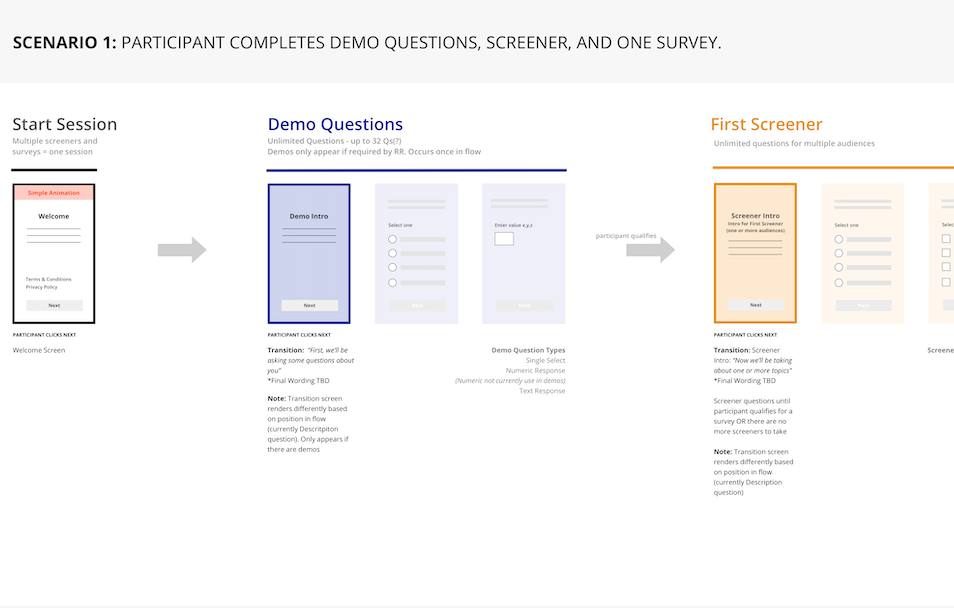
I learned that we could not add a progress bar, due to the unpredictability in the number of tests (topics) a participant may qualify for. With the goal of helping orientate users within the experience, I experimented with grouping sections of questions together in a way that would give a survey a more cohesive narrative. These “question blocks” could be easily configured and arranged to form a linear experience.
Throughout this process I regularly met with the product manager to discuss trade-offs and priorities to make sure we were addressing both business and user needs.
After a few iterations I brought the task flows to the engineering team for discussion to ensure feasibility before moving onto design.
Prototype
Prototyping played a large part in designing the experience. It enabled me to truly empathize as I worked by putting myself in the participant’s shoes. Stakeholders could also click through the screens on their mobile device to get a realistic sense of the experience.

Prototyping helped me to piece together the disjointed parts of the experience in a way that made sense. Assembling the survey in repeatable blocks with logical transition screens made it possible to ensure we were telling a clear story in a way that could reliably adapt to testing needs.
Wireframes
I handed off annotated wireframes for question types and transition screens in weekly sprints. I walked the engineering team through each set of wireframes in weekly meetings to address any questions or concerns before sharing.

Visual design
As we moved into visual design I began creating concepts, eventually presenting two to the team. Concept 1 combined a monochrome palette with light gradients and subtle shapes. This concept was intended to adapt to various survey topics, without distracting from content. Concept 2 was a bit more playful and brought some more personality to the platform. This was intended to create a more delightful and engaging experience.
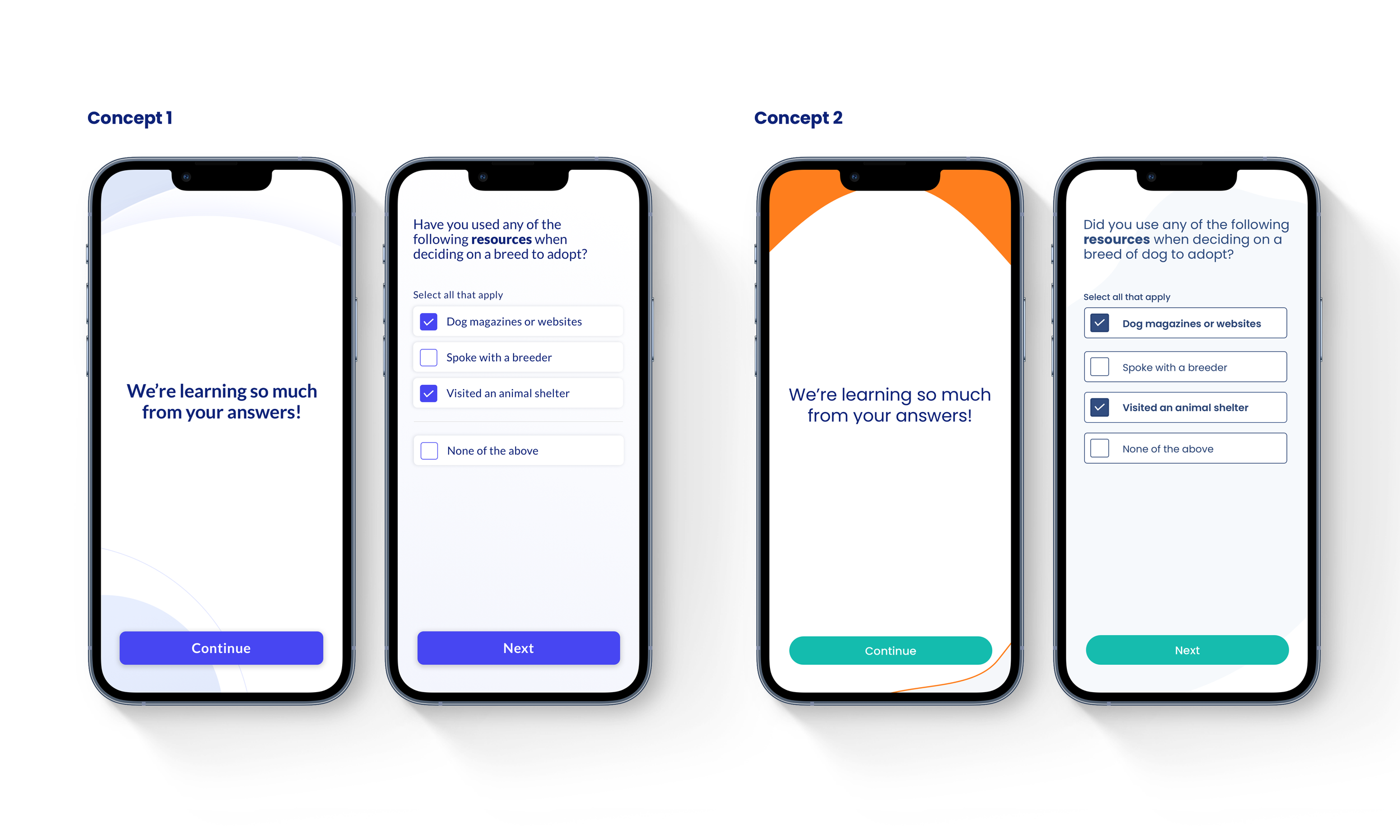
We tested both concepts with users and voted as a team to determine the direction, eventually landing on Concept 1 for its adaptability to different subject matter.
Animation
A key part of the redesign was the introduction of transitions to help participants switch contexts between sections. Adding the right kind of animation was important. The goal was to help users along in the journey and add some delight along the way, without distracting them from the task at hand.
I set about creating simple animations in Principle and collaborated with the engineers to bring them to life. Animation really set the experience apart from other survey platforms, that often felt repetitive and lacked delight. These transitions were intended to serve as a means to pull attention back to the experience at times when participants needed to pay attention or understand that a change in topic was about to occur. When used consistently, this visual cue could be a powerful tool to keep participants engaged.


Adding delight
In addition to helping users orientate themselves within the experience, I used animation to convey gratitude and encouragement. We also provided clearer messaging for participants who didn’t qualify, letting them know that the time they had given to answer screening questions was also appreciated.
Component library
Once we were clear on the questions types and screens that were needed, I set about designing key screens. I built a component library and style guide which covered text styles, color palette, button states and components that were unique to specific question types.

Other improvements
Viewing images & video
In the old experience, users were sent to external links to view files. This not only took participants out of the experience, but often left them with no clear way to navigate back to the survey. This lead to a high rate of drop-off. The product team, engineers and I brainstormed ways to display images within the survey experience and eventually landed on a simplified approach, where images and video could be viewed within the experience and referred back to easily in later associated questions. I worked on the user flows and interaction design to support this approach.

Rank question interaction
The rank question on mobile posed a significant interaction challenge. The existing mobile rank question assigned rank based on the order in which a user tapped on the answer options. This approach proved challenging when a user accidentally tapped the wrong option. Given that up to 10 answer options could be included, the margin for error was high and users would often need to restart the whole process.
I went through many iterations and eventually came up with a new approach to ranking that used a custom keyboard. Users could more easily change their rank assignment without impacting their progress. With the deadline for release approaching we were not in a position to test the design with users so instead released it and observed user sessions in Logrocket. We observed participants successfully moving through rank questions. We monitored these sessions over the weeks following release and made design tweaks to improve usability.

Improved error handling
We introduced error messaging for scenarios that had previously been unaccounted for. This included a timer screen for lost internet connection, that enabled participants to send their answers once they reconnected without loosing compensation for their time.

Welcome screen

Matrix question

Results
The redesign lead to notable improvements in metrics with our audience sourcing partners. Specifically, a significant reduction in our drop rate and our highest rate of conversion to date. Since the release, we’ve gradually introduced new features and question types, building in time for usability testing, which was not possible during the initial release. We continued to see the payoff from this design investment many months later.
